

Christmas typography does more than decorate a page: it sets the mood before the reader has processed a single sentence. The right typeface can make a gift tag feel personal, a seasonal campaign feel polished, or a social post feel instantly festive. This guide will help you choose holiday fonts that are expressive, readable, and practical for real design work.
Use decorative lettering for the moment that deserves attention, then give the rest of the design room to breathe. Whether you are creating greeting cards, packaging, sale banners, or editorial graphics, the goal is the same: make the holiday feeling clear without sacrificing clarity.
Where Holiday & Christmas Fonts Work Best

- Greeting cards and gift packaging. A flowing script, an elegant serif, or a friendly hand-lettered face can turn a simple message such as Warmest Wishes into something that feels considered and personal. Keep small text simple so names, dates, and product details stay easy to read.
- Seasonal content and editorial design. Holiday gift guides, checklists, and blog headers benefit from one memorable display font in the headline. Use it as an accent rather than the default text style throughout the article.
- Campaigns, banners, and social media. A strong holiday font helps an offer feel timely at a glance. On smaller placements, choose bold shapes and high contrast so the message remains legible on mobile screens.
How to Choose a Holiday Font That Fits the Project
Start with the personality of the message. Refined serifs and delicate scripts work well for premium gifts, dinner invitations, and elegant brands. Chunkier display fonts and playful handwritten styles suit family events, children’s products, and cheerful sale graphics. A font can be festive without relying on obvious seasonal symbols; sometimes a warm rhythm or a soft curve is all the atmosphere you need.
- Check the smallest size first. Test the font on a gift tag, phone screen, or product thumbnail before using it in a final design.
- Choose a limited character set intentionally. Confirm that the font includes the names, punctuation, currency symbols, and language characters your project needs.
- Use contrast to create hierarchy. Pair an expressive headline font with a neutral text face so that the key message is noticed first.
- Review the license before publishing. The permitted use can differ between personal, commercial, web, and client projects.
Three Rules for Pairing Holiday Typography
1. Let one font lead. If the headline has flourishes, swashes, or a handmade texture, keep the supporting type quiet. A clean sans serif gives decorative lettering the space it needs; our guide to professional clean sans serif fonts is a useful starting point for the supporting role.
2. Match the visual voice. A formal card, a cosy handmade label, and an energetic sale graphic should not all use the same treatment. Decide whether the design should feel elegant, nostalgic, playful, or modern before choosing a type family.
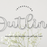
3. Make decoration functional. Outline lettering can add a lighter, contemporary feel to a festive composition, especially when it is used for a short phrase. For ideas and practical Canva use cases, see these essential outline fonts. For bolder headline inspiration, explore our roundup of creative display fonts.
Explore a Holiday Font Bundle for Your Next Design
A curated holiday font bundle can save time when you need options for several placements in the same campaign. Try a few styles in your actual layout, compare the letter spacing at final size, and keep the pairing consistent across cards, packaging, and social assets. Always check the product page for the current availability and licensing terms before use.
Holiday Font FAQ
How many fonts should I use in one festive design?
Two is usually enough: one display font for the focal message and one highly readable font for the details. Add a third only when it has a clear job, such as a price or a small label.
What makes a holiday font easy to read?
Open letterforms, sufficient spacing, and strong contrast with the background matter more than decoration. Test the final message at the smallest size where it will appear.
Can I use decorative fonts for body copy?
Use them sparingly. Decorative faces work best in short headlines, names, and emphasis; body text needs a font that remains comfortable to read for more than a few words.
Choose with purpose, test in context, and let the type support the message. The result will feel festive, consistent, and ready for the season.