The world of graphic design offers endless possibilities, but one trend that consistently stands out is the beauty of geometric simplicity. In an era where overstimulation is rampant, many designers are gravitating towards clean lines, shapes, and minimalistic forms. This shift not only creates a visual appeal but also enhances the communicative aspect of design. In this article, we’ll explore the essence of geometric simplicity, discussing its significance, practical applications for bloggers, and how to effectively incorporate it into your design projects.
The Essence of Geometric Simplicity
At its core, geometric simplicity is about distilling design to its fundamental elements—shapes, lines, and colors. This approach allows designers to create aesthetically pleasing compositions that communicate their message clearly without overwhelming the audience.
Why Geometric Simplicity Matters
- Clarity and Focus: A design featuring geometric simplicity draws attention to the key elements, allowing for easy navigation and comprehension.
- A Timeless Aesthetic: Minimalist designs have a classic quality that transcends trends, making them durable and effective for various applications.
- Enhanced User Experience: Simple layouts improve user interaction by reducing cognitive load, ensuring that the viewer can easily engage with the content.
Incorporating Geometric Simplicity into Your Designs
As a blogger and designer, applying the principles of geometric simplicity can elevate your content both visually and contextually. Here are practical tips on how to integrate this aesthetic into your own work:
1. Use Basic Shapes
Start by utilizing squares, circles, and triangles in your design. These forms can be layered, combined, or even used to frame text and images. For instance:
- Frame blog post headers with simple geometric shapes for a modern look.
- Create infographics using clean lines and basic shapes to present information clearly.
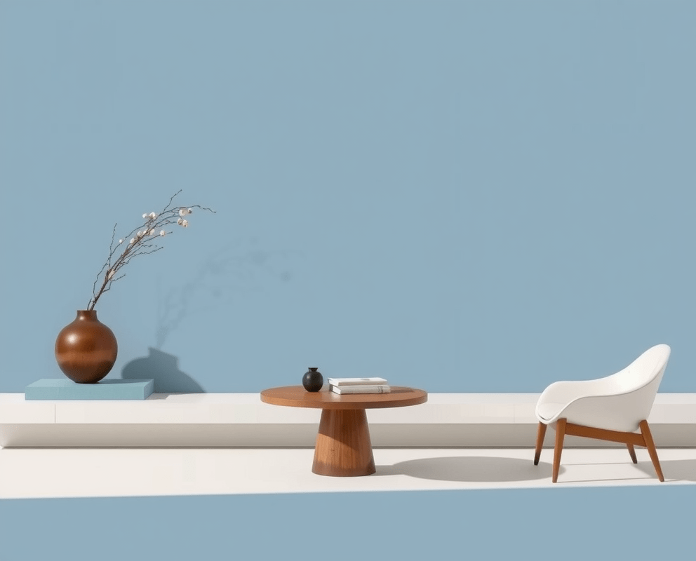
2. Limit Your Color Palette
When embracing geometric simplicity, restrict your color palette to two or three complementary colors. This controlled approach not only enhances visual clarity but also lends a sophisticated touch to your designs. Tools like Adobe Color or Coolors can assist in selecting a harmonious palette.
3. Embrace Negative Space
Negative space is a key element in geometric designs that allows the composition to breathe. Use empty spaces strategically to emphasize your content. For example:
- Leave spaces around text blocks to enhance readability.
- Utilize white or contrasting backgrounds to let your geometric shapes stand out.
Inspiration from Geometric Design Trends
To fuel your creativity, explore current geometric design trends. Websites like Behance or Dribbble provide a wealth of inspiration, showcasing the versatility of geometric simplicity. Here are a few contemporary trends to consider:
- Geometric Patterns: Incorporating repeated geometric patterns can add visual interest while maintaining simplicity.
- Bold Typography: Pair your geometric shapes with bold, sans-serif typography to reinforce your design’s minimalistic approach.
- Monochromatic Designs: Creating a design using shades of one color amplifies the geometric simplicity and can evoke a strong emotional response.
Final Thoughts
The beauty of geometric simplicity lies in its power to communicate effectively while providing a visually stunning experience. By incorporating basic shapes, limiting your color palette, and leveraging negative space, you can create designs that resonate with your audience. Remember, the goal is not to oversimplify but to create a harmonious balance that engages and empowers the viewer. So, take the plunge into geometric simplicity and watch your designs transform.